Ideas for how Joto should exist and behave as software
This page is a developing collection of front end elements and behaviours to show how Joto should appear when in software or on the web. It's the start of a living style guide.
It's purpose beyond demonstrating look and feel is to be used as a kit of parts with which to make example UI and to offer guidance for the iteration of joto.rocks. This page is responsive with consideration taken for mobile and desktop.
Typography — Open source, free fonts. Poppins for headings and UI controls and Open Sans for body copy. Working to a 6px baseline grid.
Type is dark on white so as to be high contrast and accessible.
Palette — Joy and playfulness comes from use of colour. 4 bright, vibrant brand colours to soften the reductive simplicity of the UI and product. Pink and blue used in UI for positive/negative actions. Monochrome palette for more functional use.
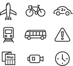
Iconography — Dummy example. Technical but friendly style, not hand drawn. Lineweight should match form inputs to create a uniformity of stroke.
Imagine pen and paper connected to the internet
Lorem ipsum dolor sit amet, consectetur. Fusce efficitur neque a diam rutrum faucibus. Curabitur sodales gravida ornare. Sed scelerisque posuere magna at tempor. In hac habitasse platea dictumst. Curabitur maximus cursus blandit.
A connected canvas for your wall
Aliquam quis porta eros. Nam vitae auctor dui. Donec lectus felis, vehicula at faucibus interdum, lacinia nec velit. Sed id lacus sed purus facilisis vestibulum vitae sit amet urna.
Aenean quam nisl, aliquam ut euismod vitae, posuere eget ante. Ut tincidunt eleifend felis, vitae dapibus sem pharetra vitae. Aenean vitae felis non odio bibendum convallis. Donec adipiscing elit, sem vitae scelerisque semper, mauris diam varius massa, a eleifend orci nibh iaculis turpis.
Integer sed tristique lectus. Aenean dignissim turpis nisi, non ornare diam lobortis sit amet. In quis metus vel est pellentesque lobortis nec non sapien.
Forms and inputs — Form fields take same line weight as iconography. Labels should not go inside fields as this is bad for accessibility, though placeholders can be used to add meaning if needed.
Delete DisabledSwitches — A web version of typically native UI feels right and suitably friendly and usable.
Draw to Joto nowJoto itself — When shown in UI, I propose we use a diagrammatic version of Joto like this. The line weight is the same as form inputs and iconography. The drawing bar can be coloured programmatically with CSS.
Loaders — Helpful to show progress and make Joto software feel alive + responsive. Useful for the video for this reason too. The 't' element works well as a spinner, though it would be interesting to explore using the logotype above.
Regions — It's likely we'll need pull out regions blocked in different colours for visual rhythm and separation and to highlight content. Here's a first pass, makes most sense view on a large display to show behaviour.
Layout / Grid — First thoughts — 6 column grid. Simple enough not to get overly complex. Complex enough to offer enough layout options. This grid is fully responsive made with modular sass mixins.